
Design and
Shopify build for
Maison Clair
A Shopify rebuild and lifecycle programme for Maison Clair. We rewrote the storefront around the two moments where money was leaking (product decision and checkout) and deliberately left the rest alone.


Client
Maison Clair
Services
Discovery
Strategy
Engineering
Web Development
Marketing
UI/UX & Design Systems
Delivery
Industry
Retail & Lifestyle
In short
As engineers and designers, we rebuilt the storefront, checkout and lifecycle programme for Maison Clair.
The interesting constraint was preserving the considered, unhurried feel of the brand while stripping friction out of the funnel, through a run of honest experiments rather than a redesign. Conversion rate rose 34% and average order value 18%, most of it from product-page and checkout changes .
Design system
Product pages that answer the objection before it forms
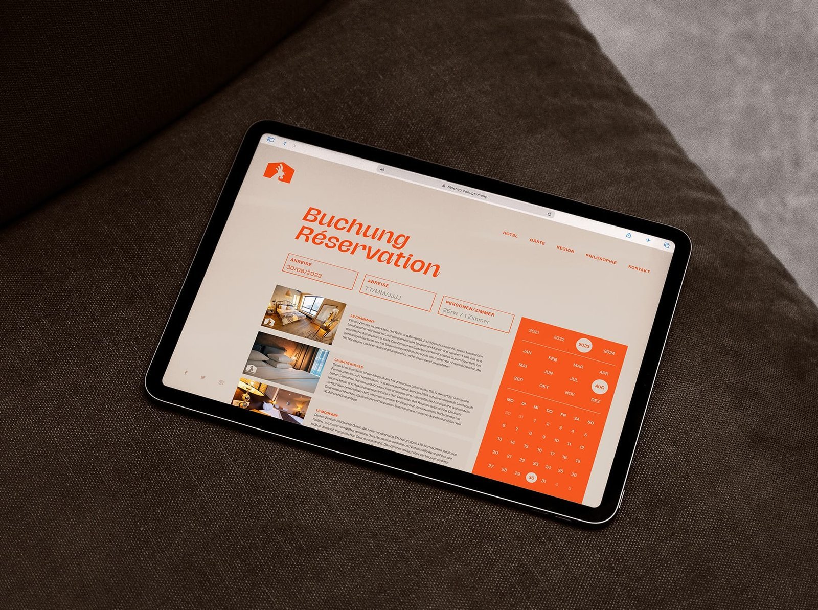
The restructured product pages put sizing, materials and delivery exactly where the hesitation happens. The content order was set by session recordings , not opinion, which is why it held its lift instead of regressing a month after launch.
Warm & distinctive
A checkout that feels as considered as the brand
The new checkout removed four steps from the previous flow and added the payment methods customers were already asking for. Clear progress and honest delivery estimates reinforce the trust the brand trades on, and leave customers with confidence rather than doubt. The restrained typography and generous spacing give the store a premium feel that matches what the brand charges for.
Commerce with a strategy
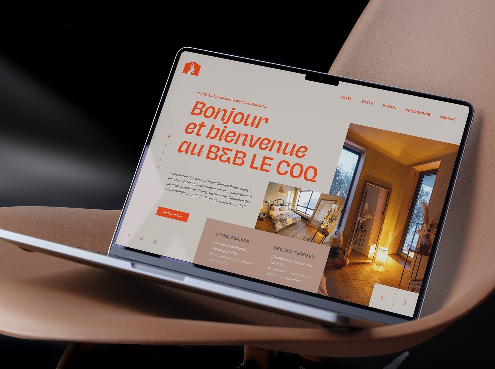
A storefront that sells the way the brand speaks
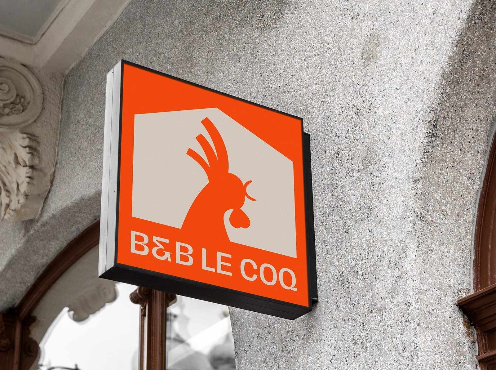
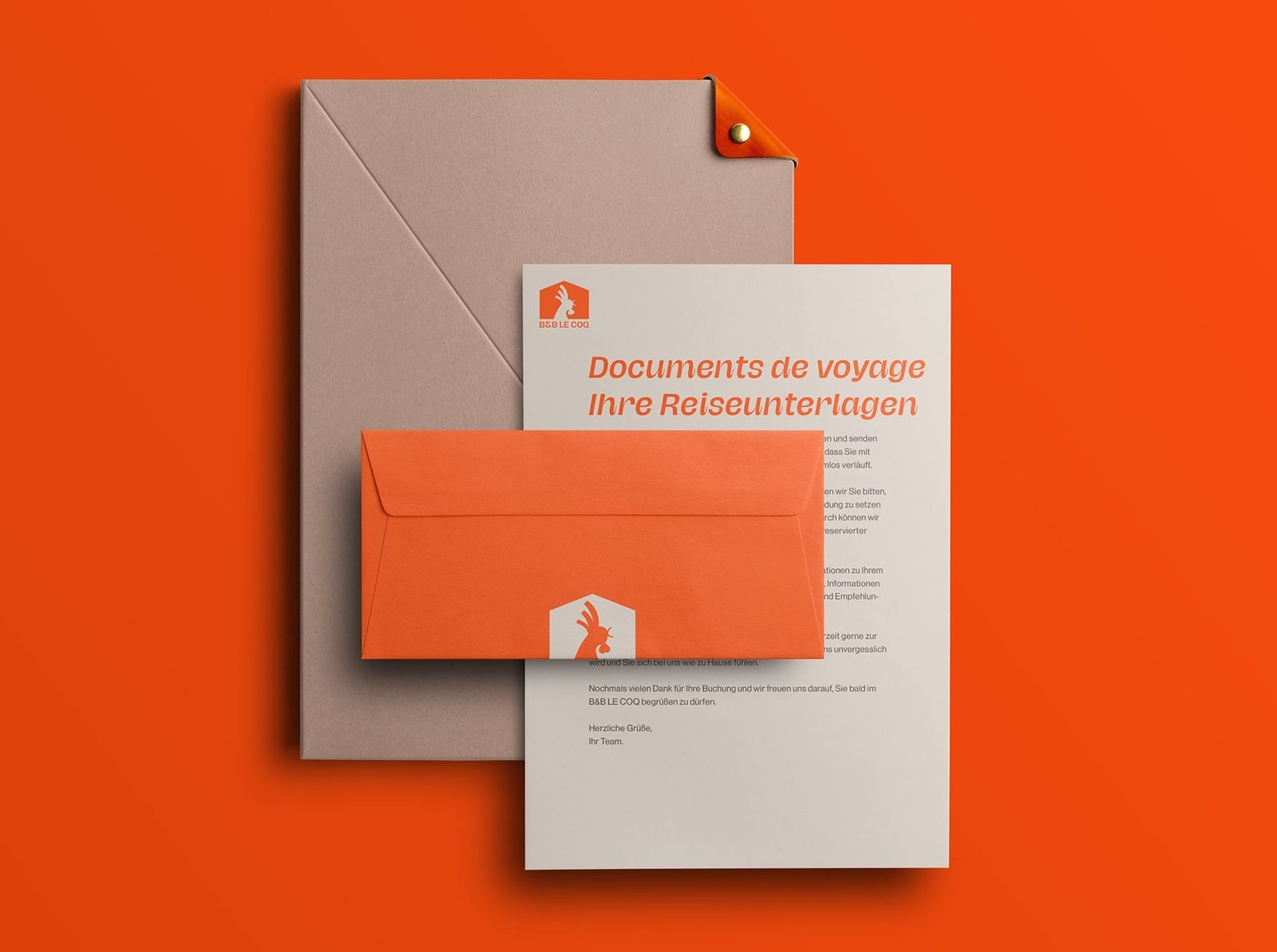
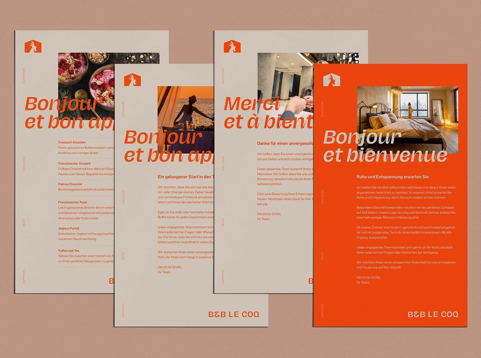
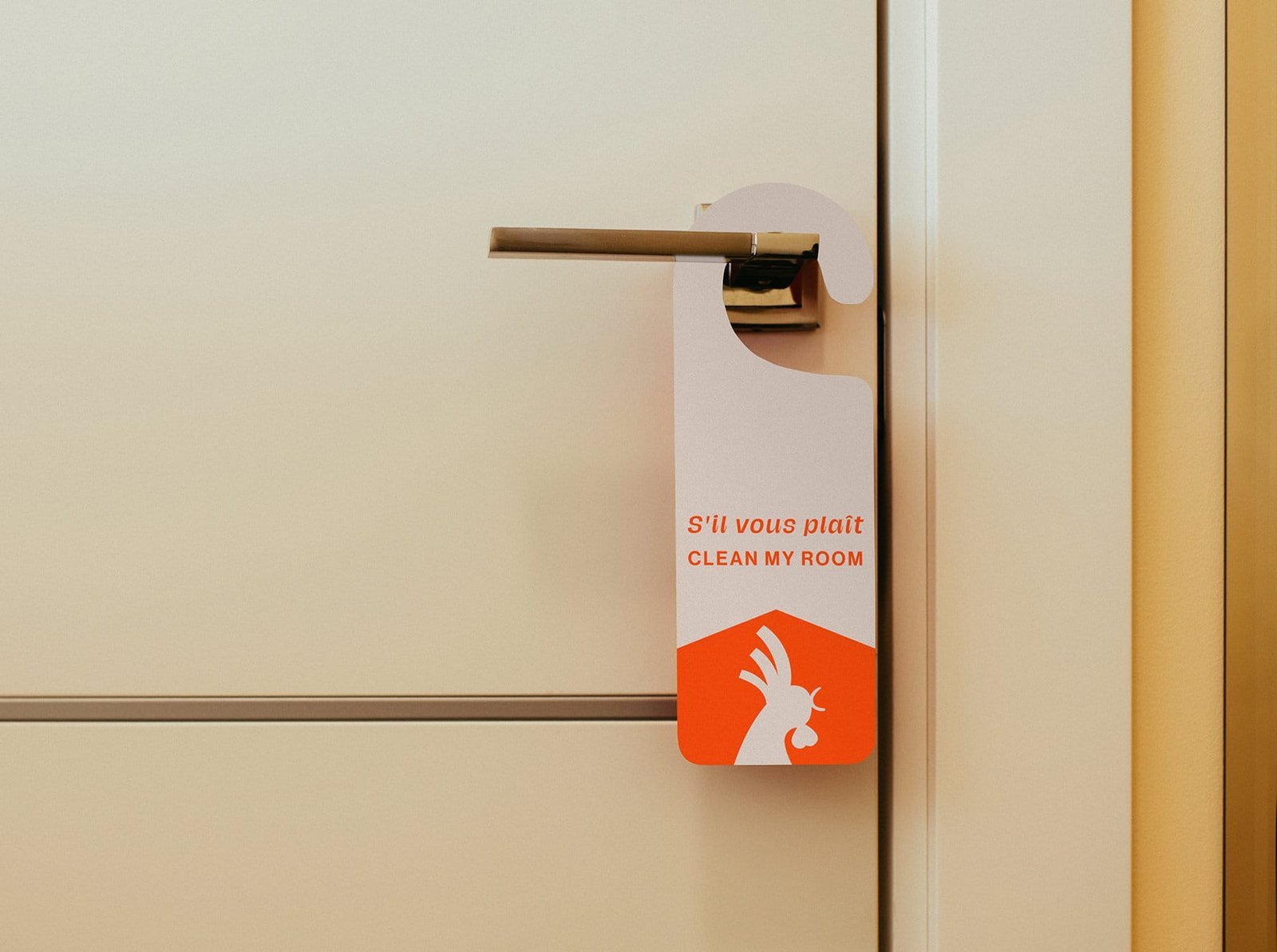
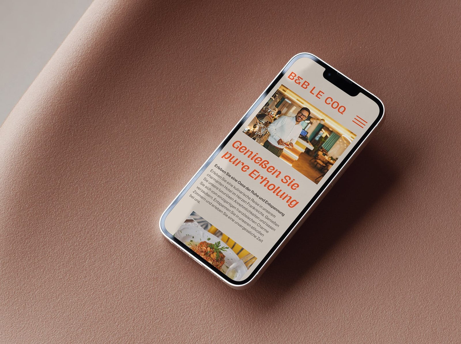
The storefront is the digital shop window that carries not just the branding but also the message and the character of the business into the buying flow. It is clearly structured, so customers find what they need and can check out without hunting for it. The goal was a checkout that feels as considered as the rest of the brand .

Codilated LLC, St. Petersburg, Florida, USA
Registered address: 7901 4th St N #5089, St. Petersburg, FL 33702, United States
info@codilated.com
+1 (805) 251-9188 (call or WhatsApp)
© 2026 Codilated LLC.
All rights reserved.